Digital Pool
Digital Pool is a startup that connects pool players to tournaments of all levels, from local pool halls to international conventions and everything in between.
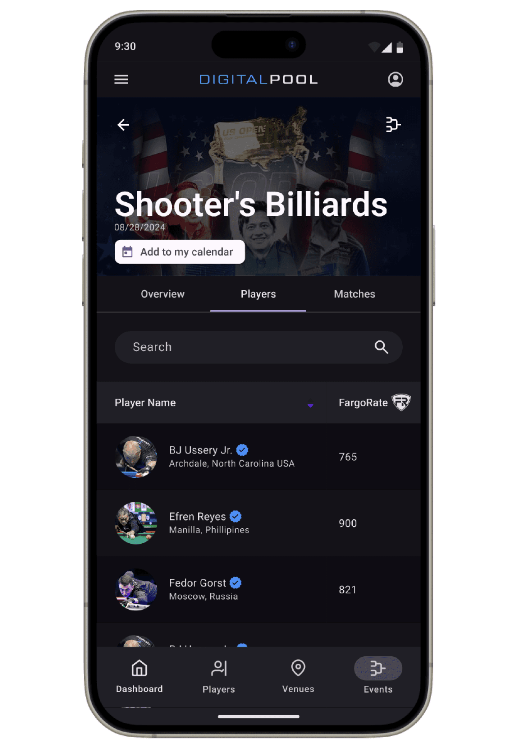
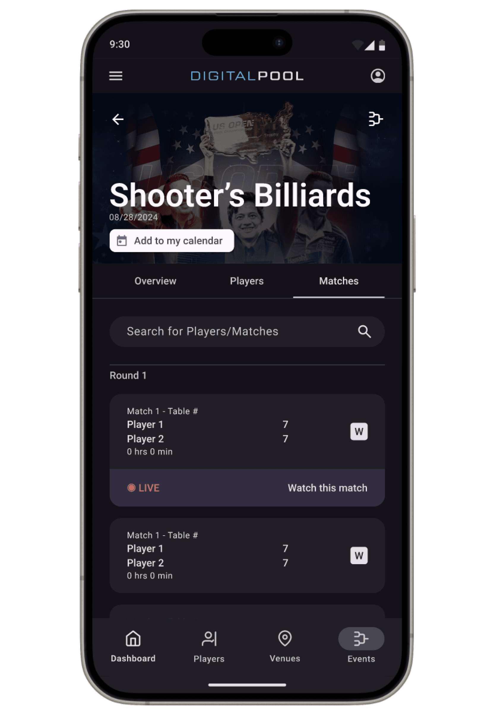
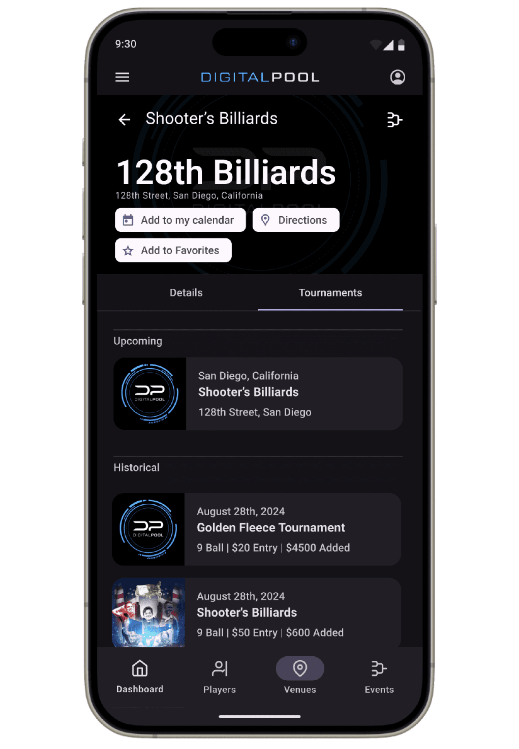
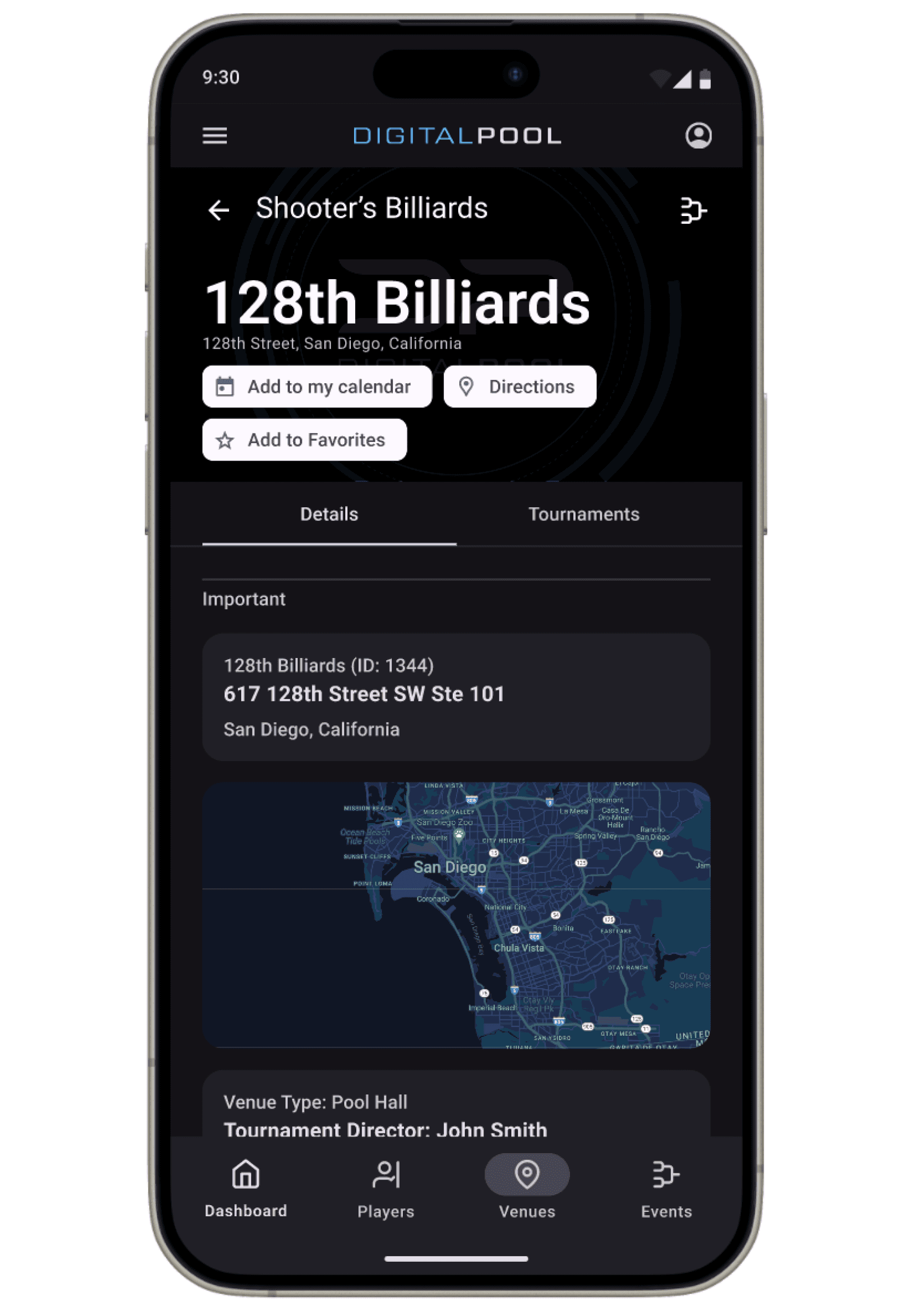
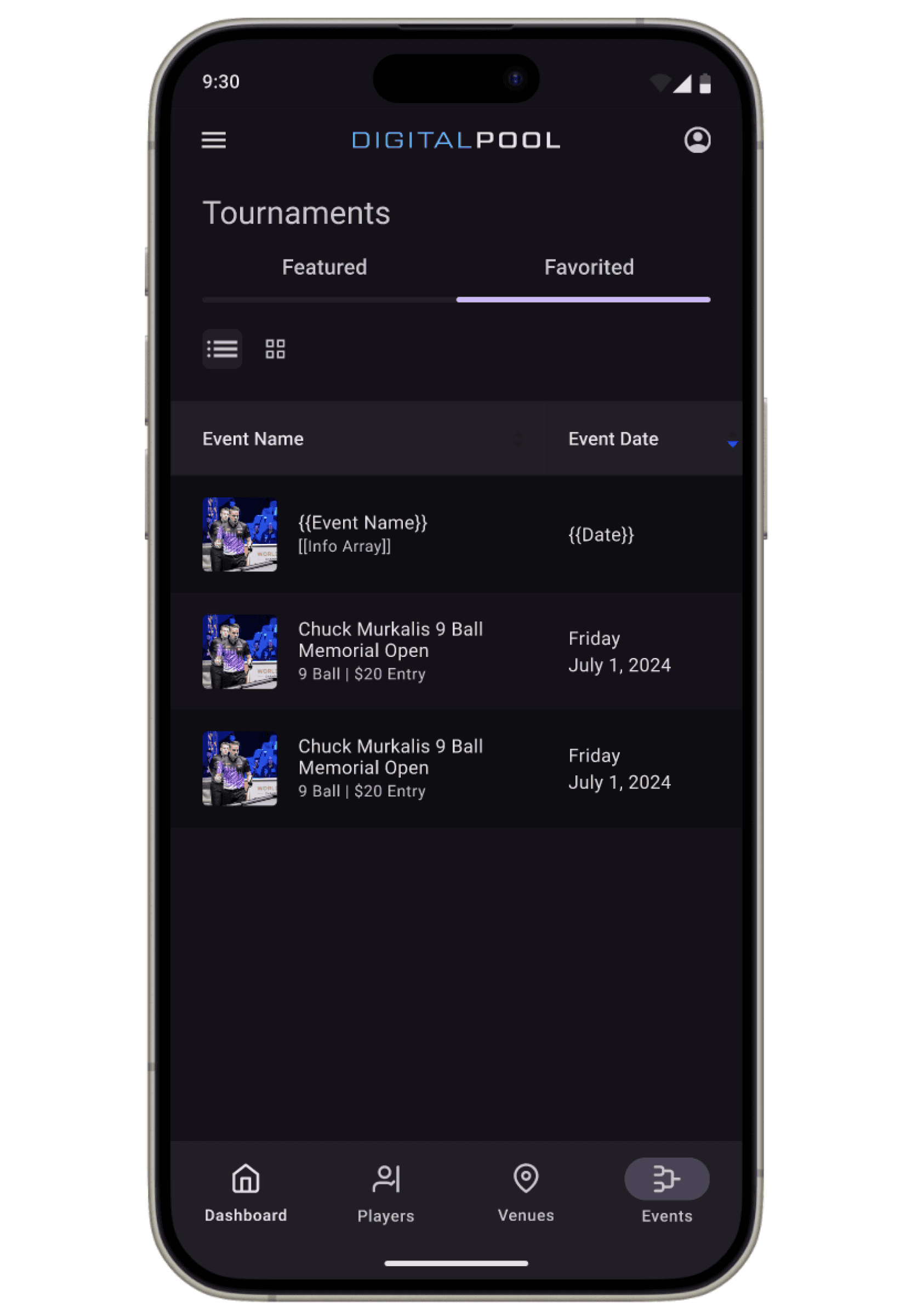
I led the design for the mobile app’s tournaments page. A quintessential part of the app that enabled users to easily browse upcoming tournaments.
My Role:
UI Design, UX design, Prototyping
Team:
Christopher Clark, Emily Tsai,
Piper Yu, Sean Tinio
Tools:
Figma
Year:
2024

STEP 0: CONTEXT
Before Digital Pool, most tournament information was scattered across random Facebook pages.
People were drawn to Digital Pool because it consolidated all tournaments onto one website.
Before Digital Pool:

After Digital Pool:
STEP 1: THE PROBLEM
However, users were having problems with finding tournaments that suited their specific needs.

Slack -
I am going on vacation this weekend! Is there a way for me to see any tournaments happening in Dallas when I’m there to visit 🤠
Slack -
I only want to see 9-ball tournaments on the tournaments page!!
Slack -
How can I see tournaments with atleast a $250 payout
Slack -
Why can I only filter tournaments by unfinished, ongoing, and completed? I want to see more filters.
On the website, you could ONLY filter tournaments by upcoming, in progress, and completed. There was definitely a way we could do better than that.
STEP 2: STARTING SOMEWHERE
Digital Pool was already planning on creating a mobile app, this was a perfect opportunity to update the current tournaments page.
We had to start from scratch.
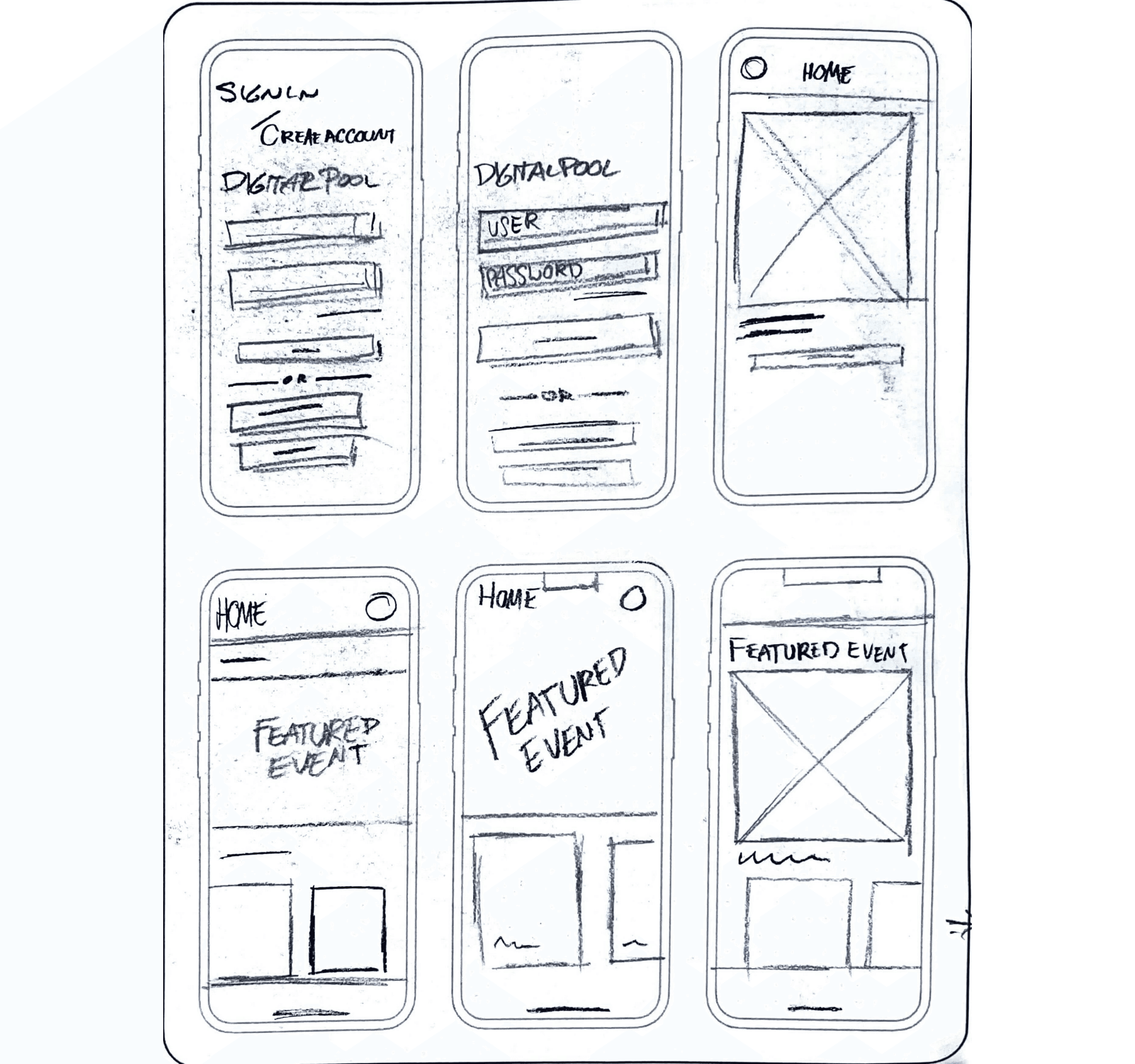
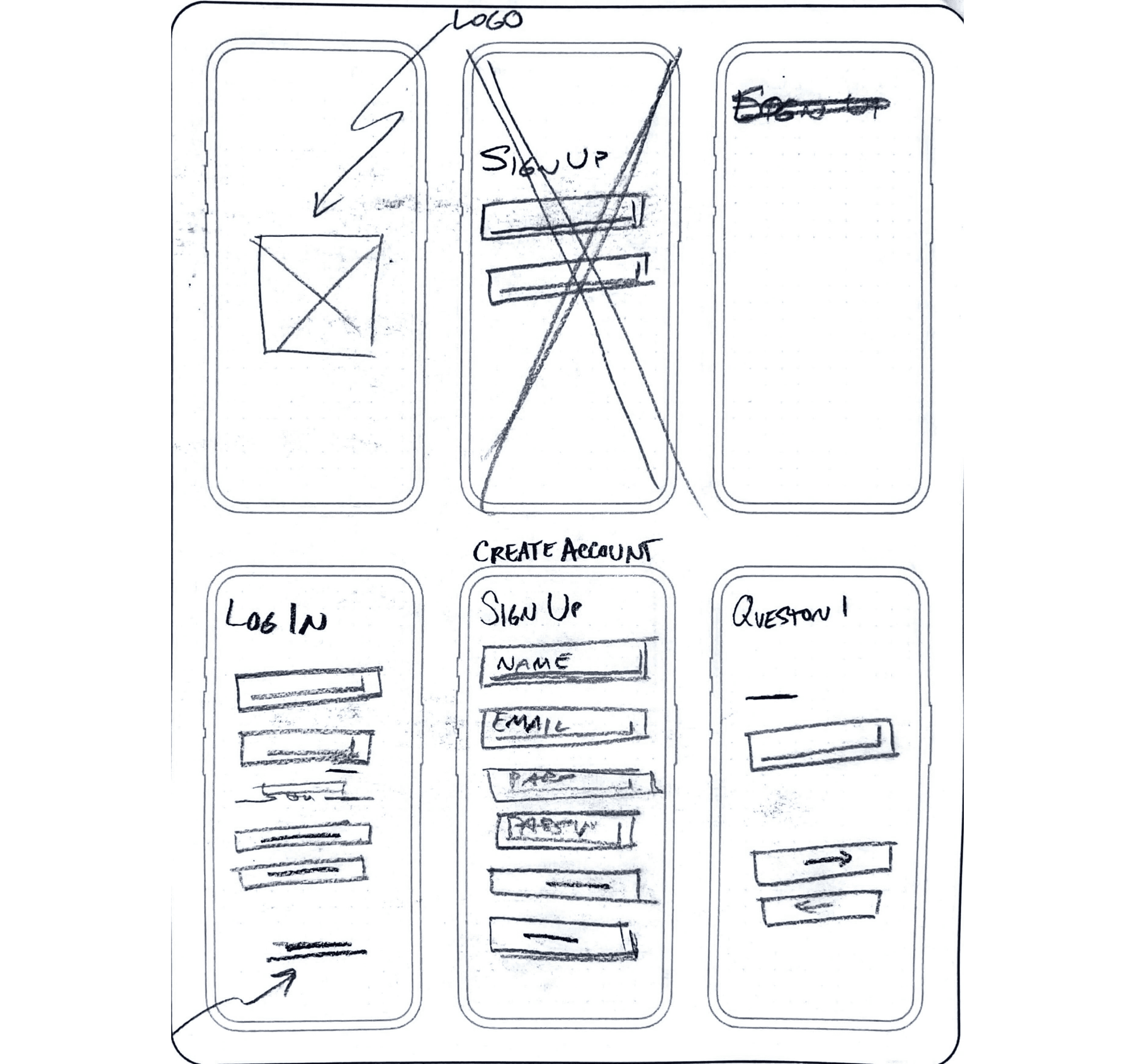
I did a lot of internal testing and reached out to multiple colleagues to get their feel of the product as I built various iterations.

After my first iteration, I got some necessary feedback:
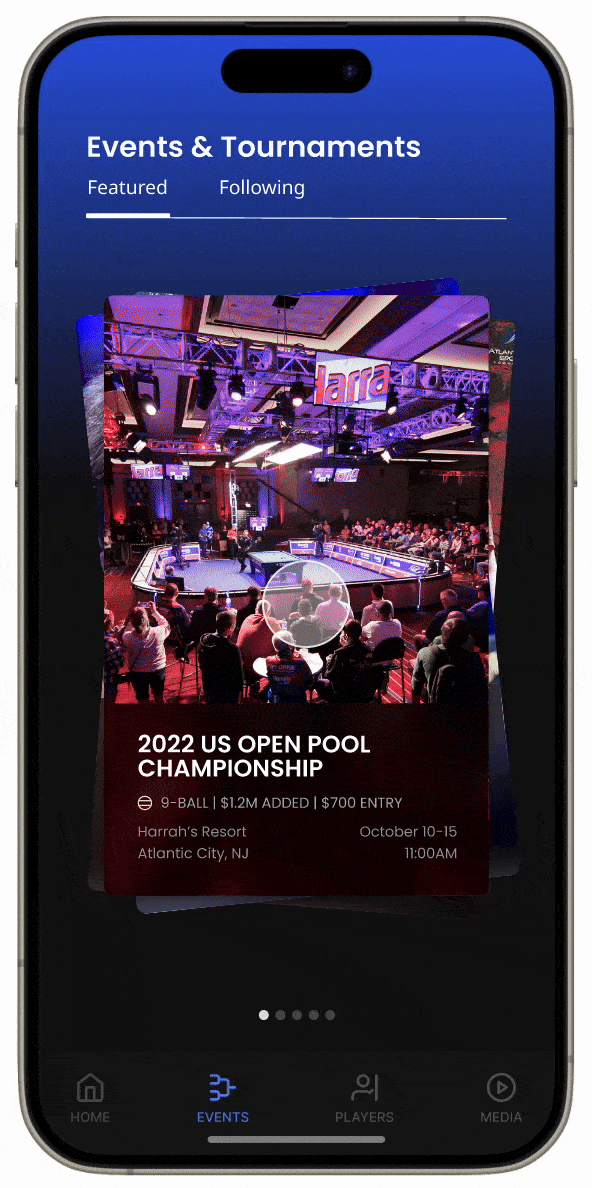
PM: Get rid of the swiping carousel feature.
CEO: Yeah an endless scroll will be a better design, at times there will be 250+ tournaments, can’t imagine swiping through everyone of them.
SWE: Premium features will have to be in version 2 of the app, only focus on the tournaments page for now.


Even more feedback:
PM: We should implement Google M3 as our design system.
CEO: I like having the filters button being integrated into the search bar, lets run with the design on the left.
SWE: Yeah go with the design on the left, gradients will slow the app down.
And even more feedback
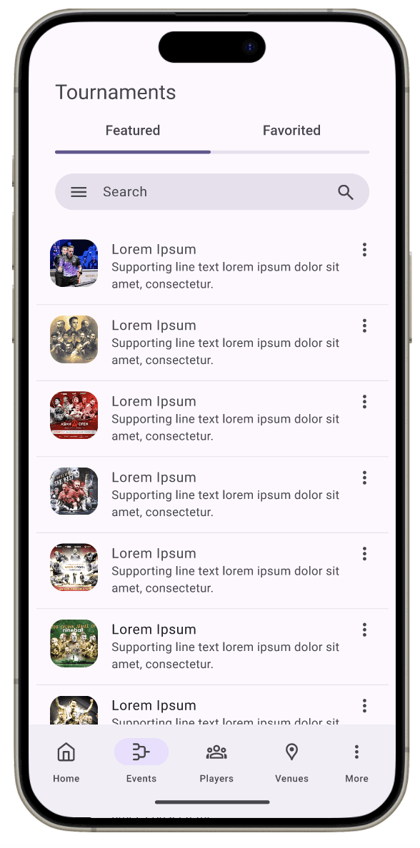
PM: This is too list like.
CEO: It is missing the Digital Pool feel!
SWE: We like the look of dark mode better, keep it only as dark mode way for now.
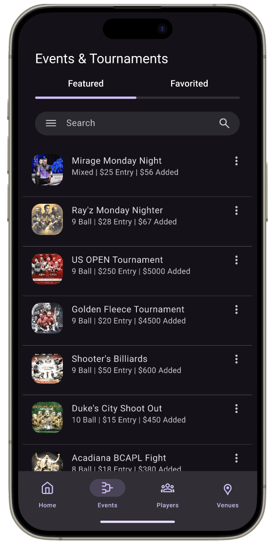
STEP 4: FINISHING TOUCHES
After listening and implementing everything the team wanted out of the app, I tinkered with the design until it was just right.


STEP 5: TAKEAWAYS
As we approach the launch of the redesigned Tournaments page for Digital Pool, we have established clear, measurable objectives to evaluate the success of this initiative:
Achieve a 40% increase in mobile user sessions within the first three months post-launch.
Attain a 20% rise in monthly active users over six months.
Ensure that over 90% of users, particularly middle-aged men, find the app accessible and easy to navigate.
By focusing on these anticipated outcomes, we aim to create a more engaging, user-friendly, and accessible platform that meets the needs of our diverse user base.
Let’s collab!